[dismiss]
| Welcome to SmashWiki! Log in or create an account and join the community, and don't forget to read this first! |
| Notices |
|---|
| The Skill parameter has been removed from Smasher infoboxes, and in its place are the new "Best historical ranking" and "Best tournament result" parameters. SmashWiki needs help adding these new parameters to Smasher infoboxes, refer to the guidelines here for what should be included in these new parameters. |
| When adding results to Smasher pages, include each tournament's entrant number in addition to the player's placement, and use the {{Trn}} template with the matching game specified. Please also fix old results on Smasher pages that do not abide to this standard. Refer to our Smasher article guidelines to see how results tables should be formatted. |
| Check out our project page for ongoing projects that SmashWiki needs help with. |
Template talk:SSBMCharacters
From SmashWiki, the Super Smash Bros. wiki
Jump to navigationJump to search
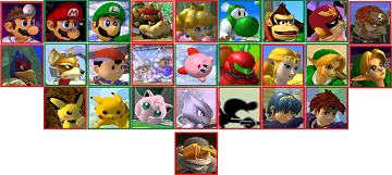
Hey guys, so I have an idea: Should we replace this with an image using image map? I have created one:
| show Characters in Super Smash Bros. Melee |
|---|
If you're not familiar with this, basically you click on an image which takes you to the character's page. Before you ask, I made Zelda link to this page. ----- Conanshinichi (talk) 21:17, 11 July 2013 (EDT)
- It's not a bad idea in my opinion. That said, had I gotten to this first, I would have done a table containing these icons instead of the character selection screen. In addition your proposed template is a little large and would have to be scaled down (which the imagemap code would automatically compensate for, just so you know), which might make it look a bit silly on wide resolutions. Toomai Glittershine
 The Indescribable 23:11, 11 July 2013 (EDT)
- Sure, I'll make it with those icons that you've shown, and personally prefer them over the character selection screen. Though you said, it is a little large but it would look silly on wide resolutions? So do I just make a smaller one? ----- Conanshinichi (talk) 23:47, 11 July 2013 (EDT)
- By "silly on wide resolutions" I mean that the template will have its title bar across the whole screen and a few rows of boxes in the middle with much blank space on both sides. Having anything of fixed width in a container of elastic width tends to do that.
- The other minor problem with this idea is that it removes the split between newcomers and veterans, which admittedly is not that important in the grand scheme of things. Toomai Glittershine
 The Altruistic 23:52, 11 July 2013 (EDT)
- I can fix the latter problem by making the veterans' box in green, and the newcomers' in red. BTW I am using your icons and I'm arranging them the way Melee does. But I wonder, where should I put Sheik? Below Young Link? or use another order? or use the Zelda/Shiek Icon? or below Mewtwo, at the bottom of everyone else? Once again, thanks! ----- Conanshinichi (talk) 23:57, 11 July 2013 (EDT)
- Update, this is what the new one looks like:
- I can fix the latter problem by making the veterans' box in green, and the newcomers' in red. BTW I am using your icons and I'm arranging them the way Melee does. But I wonder, where should I put Sheik? Below Young Link? or use another order? or use the Zelda/Shiek Icon? or below Mewtwo, at the bottom of everyone else? Once again, thanks! ----- Conanshinichi (talk) 23:57, 11 July 2013 (EDT)
- Sure, I'll make it with those icons that you've shown, and personally prefer them over the character selection screen. Though you said, it is a little large but it would look silly on wide resolutions? So do I just make a smaller one? ----- Conanshinichi (talk) 23:47, 11 July 2013 (EDT)
| show Characters in Super Smash Bros. Melee |
|---|
Btw I'm loving these icons, they make the coding a little easier.Plus they look cooler :) ----- Conanshinichi (talk) 01:00, 12 July 2013 (EDT)
- Edit: I've made a new one, credit to Solar Dragon for the idea:
| show Characters in Super Smash Bros. Melee |
|---|
This one does not use imagemap, therefore it is more practical and now it's much more clearer which character is a veteran and which is a newcomer. Plus, it expands through the whole page. ----- Conanshinichi 11:53, 13 July 2013 (EDT)
- I prefer this over the imagemap version., though I'm actually currently not convinced we need images in a navigation template. Toomai Glittershine
 The Sharp 12:17, 13 July 2013 (EDT)


