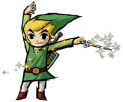
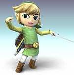
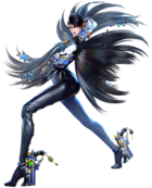
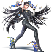
Character artwork
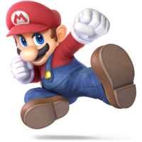
Character artwork refers to the official images of the playable Smash fighters used in-game and in promotional materials such as websites, strategy guides, and posters. In the original Super Smash Bros., the artwork for the characters are 2D illustrations not seen in the game itself. From Melee onward, however, they are rendered from 3D models at a far higher quality than how they appear in gameplay. In Melee, some pieces of character artwork were used in-game, but not all. Starting in Brawl, cropped versions of the character artwork are used in the character selection screen. In Brawl and Smash 4, each character's main render also serves as the basis of their Classic Mode trophy. The character renders in Smash 4 and Ultimate are additionally the basis of the Super Smash Bros. series of amiibo.
Super Smash Bros.
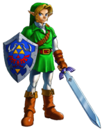
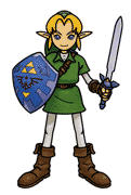
The character artwork of Super Smash Bros. is very different from all the games following it, not only because its use of 2D artwork but also due to its unique artstyle even compared to other games at the time. Rather than detailed art that accurately reflects the characters' in-game designs, the official artwork is heavily stylized, using thick lines and flat shading. Link and Samus are prominent examples of this artstyle deviating from previous artwork.
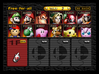
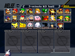
Strangely, despite all characters having artwork created for this game, the in-game character select screen instead uses renders based on pre-existing artwork from earlier games. The artwork on the select screen includes 2D and 3D artwork, though all are edited to appear as if they are 3D.[1]
The origin of each character's selection screen artwork is as follows:
- Mario: A render from Super Mario 64.
- Donkey Kong: A render from Donkey Kong Country.
- Link: Artwork from The Legend of Zelda: Ocarina of Time.
- Samus: Artwork from Super Metroid.
- Yoshi: Artwork from Super Mario World 2: Yoshi's Island.
- Kirby: Artwork from Kirby's Dream Land 3, which itself is a modified artwork of Sword Kirby from Kirby Super Star.
- Fox: Artwork from Star Fox 64.
- Pikachu: Artwork from the Japanese Pokémon Blue.
- Luigi: Appears to be a mix of Luigi's artwork from Mario Kart 64, and artwork based on Mario from Super Mario 64.
- Ness: Artwork from EarthBound.
- Captain Falcon: Artwork from F-Zero X.
- Jigglypuff: Artwork from the Japanese Pokémon Red and Green.
Super Smash Bros. Melee
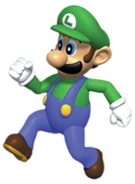
Super Smash Bros. Melee was the first game in the series that used 3D renders with a semi-realistic artstyle, which is retained in other installments moving forward. However, compared to games after Melee, the roster looks noticeably different: due to being released slightly after the launch of the Nintendo GameCube, many of the character designs are based on artwork from the Nintendo 64 era with additional realistic textures and detail. This causes the game to look very unique to many other games even outside of the Smash Bros. series. One example is Luigi, who uses his design from N64 games such as Mario Kart 64 and Mario Party, which lacks his lanky anatomy that was codified in Luigi's Mansion.
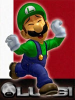
Similar to Smash 64, its character select screen has unique artwork, but unlike Smash 64, these pieces of artwork retain Melee's artstyle, and not every character has a unique render. Mario, Peach, Yoshi, Link, Young Link, Kirby, Falco, and Pikachu are the only characters whose portraits on the character select screen do not have a unique render. Additionally, the portraits of Fox and Zelda are unique on the character select screen, but match their character artworks when selecting their alternate costumes, while Mewtwo has a unique render when selecting its alternate costumes that does not match its character artwork.
Super Smash Bros. Brawl
Super Smash Bros. Brawl retains similar artistic direction as Melee, but had many assets built completely from the ground up to take advantage of the more powerful hardware. Many characters returning from Melee were also redesigned to match more current installments, such as The Legend of Zelda cast, who were updated to their designs in Twilight Princess (including Sheik, who did not appear in said game, but received a new design akin to its art direction). The overall aesthetic includes highly detailed textures and dark shading that give the game a more realistic look in comparison to the rest of the series. While this is a natural transition for characters such as Snake, it is a drastic difference for others such as Ness and Toon Link, who gained significant detail in the transition.
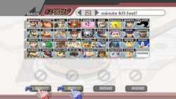
Brawl was also the first game in the series to use the same renders on the character selection screen as the official promotional artwork, which was retained in future installments.
Super Smash Bros. 4
The foundation of Super Smash Bros. 4's artstyle is similar to Brawl, but relies less on dark shading and realistic textures, instead utilizing brighter primary colors with a vibrant, cartoon-like aesthetic for its visual effects. The 3DS version has exaggerated lighting and thick outlines around the characters (which can be adjusted in the game's settings) to allow for better visibility on the smaller screen, while the Wii U version has no outlines and more subdued lighting in comparison. Some characters also have updated appearances from Brawl, such as Samus, Marth, and Little Mac, who use designs from games released in the interim. Other characters, such as The Legend of Zelda cast, use the same designs as Brawl in spite of newer designs being introduced.
Super Smash Bros. Ultimate
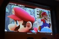
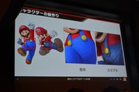
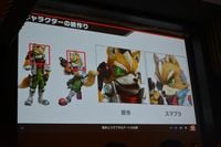
Ultimate's artstyle was designed as a hybrid of color and detail, to give the characters a unified appearance without having to drastically change each character's design. All characters were made to fit this middle ground: characters like Mario were given a slightly less colorful but more detailed appearance, while characters like Fox were given less detailed appearances to appear more visually similar to Mario and other characters. As with SSB4, some characters were given updated designs (Link appears in his Breath of the Wild design, and Fox uses his Star Fox Zero design), while others were not given an update (Samus still uses her Other M design).
Masahiro Sakurai and his team wanted the game's style and graphics to have more natural lighting, so they used real-life photographs of character figurines as reference.[2]
Panoramic banner
Another noticeable example of Ultimate's unique art style comes from its panoramic poster, which features every playable character in the roster. The banner has a unique hand-painted look that reflects the game's balance between color and detail. It was conceptualized by Sakurai and illustrated by Yusuke Nakano, who designed characters for The Legend of Zelda series and Super Metroid. Nakano decided to spread the roster evenly across the entire canvas, rather than focusing on the center, to keep the whole image visually interesting and balanced. He also consulted with the original creators on each character's pose within the artwork.[3] Character artwork in the banner was used for the game's box art.
