Talk:List of taunts (SSBM): Difference between revisions
From SmashWiki, the Super Smash Bros. wiki
Jump to navigationJump to search
TheNuttyOne (talk | contribs) |
Aidanzapunk (talk | contribs) No edit summary |
||
| Line 26: | Line 26: | ||
:::I like how no one likes 2, yet it's the current style, only animated... <span style="font-family:Monotype Corsiva; font-size:12pt">[[User:Serpent King|<span style="color:#008833; text-shadow:0px 0px 3px #00bb77;">'''Serpent'''</span>]] [[File:SKSig.png|16px|link=]] [[User talk:Serpent King|<span style="color:#eed000; text-shadow:0px 0px 3px #ffd000;">'''King'''</span></span>]] 15:54, 10 November 2015 (EST) | :::I like how no one likes 2, yet it's the current style, only animated... <span style="font-family:Monotype Corsiva; font-size:12pt">[[User:Serpent King|<span style="color:#008833; text-shadow:0px 0px 3px #00bb77;">'''Serpent'''</span>]] [[File:SKSig.png|16px|link=]] [[User talk:Serpent King|<span style="color:#eed000; text-shadow:0px 0px 3px #ffd000;">'''King'''</span></span>]] 15:54, 10 November 2015 (EST) | ||
::::Lol yeah <small>---Preceding unsigned comment added by [[Special:MyPage|<font color="brown">a turkey</font>]]! Or maybe [[User:DatNuttyKid|DatNuttyKid]].</small> 15:56, 10 November 2015 (EST) | ::::Lol yeah <small>---Preceding unsigned comment added by [[Special:MyPage|<font color="brown">a turkey</font>]]! Or maybe [[User:DatNuttyKid|DatNuttyKid]].</small> 15:56, 10 November 2015 (EST) | ||
:::::(edit conflict) I don't know, I just find inconsistency weird. I mean, if the black backdrop is hard, then I'd recommend 2, if anything, and I use [[Metal Box/Character gallery|this]] as a reference. [[File:AidanzapunkSig1.png|20px]][[User:Aidanzapunk|<span style="color: blue;">'''Aidan'''</span>]], [[User talk:Aidanzapunk|<span style="color: blue;">'''the Wandering Space Warrior'''</span>]][[File:AidanzapunkSig2.png|20px]] 15:58, 10 November 2015 (EST) | |||
Revision as of 15:58, November 10, 2015
There are 3 different ways I am considering doing this
I am going to animate each of these taunts, but I am not exactly sure how yet. I want to know what you guys think. I can
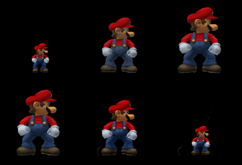
- Do all taunts over a completely black background (go to Home-Run Stadium with develop mode on)
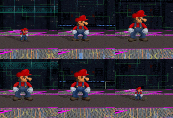
- Do all taunts on FD
- Do each taunt on a stage relevant to the character in question.
Here are examples of each
Let me know what you think! Serpent ![]() King 04:01, 10 November 2015 (EST)
King 04:01, 10 November 2015 (EST)
- Option 1 allows for the best display. Option 2 may be a bit repetitive, but I am OK with that. Option 3 allows for the most relevant stage choice. Tough choice really... But I'm voting Option 1 -> Option 3 -> Option 2.
 INoMed (Talk • Contribs) 04:08, 10 November 2015 (EST)
 - Any of the above are fine as long as it's consistent. Miles (talk) 04:24, 10 November 2015 (EST)
- I know they are all ok to be used, but I want a consensus on which looks better. Serpent
 King 09:01, 10 November 2015 (EST)
- Personally, I find Option 1 the best.
 Aidan, the Wandering Space Warrior
 09:03, 10 November 2015 (EST)
 - I concur with INoMed in terms of best appearances.
 Nyargleblargle (Talk | Contribs) 15:39, 10 November 2015 (EST)
- I'm kinda torn between option 1 and option 3 to be honest. It'd be cool to see each character on their respective stages, but the black background leaves the gif less distracting and easier to focus on the character in question. Disaster Flare (talk) 15:42, 10 November 2015 (EST)
- I'm leaning 3, but I'd be fine with 1 as well. 2 is... meh... ---Preceding unsigned comment added by a turkey! Or maybe DatNuttyKid. 15:50, 10 November 2015 (EST)
- I'm kinda torn between option 1 and option 3 to be honest. It'd be cool to see each character on their respective stages, but the black background leaves the gif less distracting and easier to focus on the character in question. Disaster Flare (talk) 15:42, 10 November 2015 (EST)
- Personally, I find Option 1 the best.
- I know they are all ok to be used, but I want a consensus on which looks better. Serpent
So far, support seems to be for option 1 (which is great, because that's the hardest one to do...). Serpent ![]() King 15:51, 10 November 2015 (EST)
King 15:51, 10 November 2015 (EST)
- I mean, most people seem to be okay with 3 as well (except maybe Aidan) so if it's too much trouble I don't think it would be a problem if you used that instead. (I'm a little biased though since it's my preference) ---Preceding unsigned comment added by a turkey! Or maybe DatNuttyKid. 15:52, 10 November 2015 (EST)
- Yeah, I'm leaning more toward 3 as well. Disaster Flare (talk) 15:53, 10 November 2015 (EST)
- I like how no one likes 2, yet it's the current style, only animated... Serpent
 King 15:54, 10 November 2015 (EST)
- Lol yeah ---Preceding unsigned comment added by a turkey! Or maybe DatNuttyKid. 15:56, 10 November 2015 (EST)
- (edit conflict) I don't know, I just find inconsistency weird. I mean, if the black backdrop is hard, then I'd recommend 2, if anything, and I use this as a reference.
 Aidan, the Wandering Space Warrior
 15:58, 10 November 2015 (EST)
- (edit conflict) I don't know, I just find inconsistency weird. I mean, if the black backdrop is hard, then I'd recommend 2, if anything, and I use this as a reference.
- Lol yeah ---Preceding unsigned comment added by a turkey! Or maybe DatNuttyKid. 15:56, 10 November 2015 (EST)
- I like how no one likes 2, yet it's the current style, only animated... Serpent
- Yeah, I'm leaning more toward 3 as well. Disaster Flare (talk) 15:53, 10 November 2015 (EST)


