Super Smash Bros. logo
- This article gives information on the Smash universe logo. For information about the logos of other game universes, see Series symbol.
The Super Smash Bros. logo, which represents both the series and the universe, is a circle or sphere split by one horizontal line and one thicker vertical line, which intersect at a specific point to the bottom left of the circle's center. This symbol made its first appearance in the introduction clip of the original Super Smash Bros. It appears in many places elsewhere throughout the game and its successors, and is used in other media associated with the series, such as the Smash Bros. DOJO!! website. It is also used as the series symbol of the Mii Fighters.
Masahiro Sakurai provided an explanation for what the logo represents on Smash 64's website. Intended to be simple in design, Sakurai stated that the cross represents the crossover of the various Nintendo characters and properties, while the logo's four sections reference the four-player aspect of the games.
On items and other objects
- Assist Trophy – The logo appears embossed on the inside base of the item.
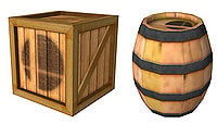
- Barrel – The logo is printed on the top surface of traditional or "garden" Barrels in Brawl, but not their themed counterparts, and all Barrels in Melee.
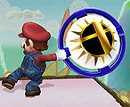
- Bumper – The logo is part of design in the centre of the item. The logo is black and gold in Super Smash Bros. and Brawl and yellow and orange in SSB4 and Ultimate.
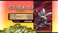
- Coins – The collectable currency in Melee and Brawl is depicted in the form of gold coins with the Smash Bros logo on both sides.
- Crates and Rolling Crates – the logo is printed on the side of traditional Crates and Rolling Crates in Brawl and is printed on all Crates in Melee.
- Fake Smash Ball – Similar to a Smash Ball, this item takes on the form of a floating Smash Bros. logo. However, it's depicted with a thicker horizontal line and a thinner vertical line; the inverse of the regular Smash symbol.
- Fighting Wire Frames – both Melee's male and female Fighting Wire Frames sport a red Smash Bros. logo on their faces. Their head icons also consist of the Smash Bros. logo.
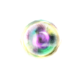
- Smash Ball – this item takes the form of a floating Smash Bros. logo that cycles through different colours of the rainbow.
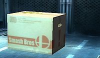
- Snake's cardboard box – The box under which Snake hides has the logo printed on its side in red, alongside the text "Smash Bros".
- Trophy Stand – the logo appears on the top surface of the Trophy Stand item.
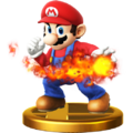
- Trophies – the logo on the upper surface of trophy bases.
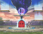
- Save Points – The Great Maze of Brawl's Subspace Emissary features a hovering pink or yellow Smash Bros. logo in each of its Save Points.
- Ray Gun - Inside the barrel, as of SSB4 and Ultimate.
- Home Run Bat - At the base of the grip, as of SSB4 and Ultimate.
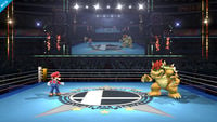
- The floor of the Smash Bros. version of the Boxing Ring.
- The "KOF" logo on the floor of the King of Fighters Stadium stage, with it taking the place of the "O".
- In the background of parts of the Smash Run stage.
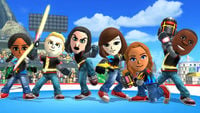
- On outfits for the Mii Fighters.
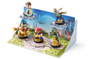
- On the bases of Super Smash Bros.-series amiibo.
As a design element
- Characters and bosses belonging to the Smash Bros. universe, such as the Fighting Polygons, Wire Frames and Alloys, Mii Fighters and Master Hand and Crazy Hand, display the Smash Bros. logo next to their damage meters, as their character series symbol.
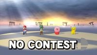
- If a match ends with No Contest, the Smash Bros. logo can be seen on the results screen in place of the winner's series symbol.
- A shadow of the logo is also cast on the ground in the No Contest results screen of SSB4.
- In the original Super Smash Bros., the logo appears on the character select screen in the place of any player slot that is not assigned to a human or computer player.
- The logo appears in the bottom right of the Menu screen in Super Smash Bros., and in the menu's background along with the other Smash Bros. logos.
- During Training Mode in Super Smash Bros., every stage's background is replaced with the logo.
- The Pause screen in Super Smash Bros. features the logo.
- In Melee, the room featured in the Collection mode has two window shades near the corner of the rooms; a faint logo can be seen on both of them. In Brawl's Trophy Hoard, a large Smash logo can be seen on the floor underneath the trophies.
- The letter "O" in the title artwork for every game starting with Melee is represented by an image of the logo. Brawl's Subspace Emissary title artwork also features the logo in this fashion.
- The loading screen in Brawl displays a spinning or flashing Smash Bros. logo. In SSB4, it's a fiery Smash logo with a spinning outline, and in Super Smash Bros. Ultimate, it's a static logo orbited by a spinning line.
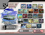
- On the stage selection screen of Brawl and subsequent games, the logo appears alongside the title of any stage that identifies with the Smash Bros. universe as opposed to other game universes.
- In Brawl, various versions of the logo represent various Difficulty settings – "easy", "medium" and "hard" in Event Mode, with the addition of "very hard" and "intense" in Classic Mode and The Subspace Emissary. As well as variations in color, the icons that represent the easiest difficulties have one or both of the logo's lines removed, while the "hard" difficulty has both lines, and the icons that represent the even more difficult settings have additional, diagonal lines.
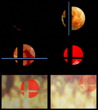
- The opening movie of Super Smash Bros. 4 starts by showing a black screen which is then broken by two slashes (using a slash-esque sound effect), one vertical and the other horizontal in a very similar fashion to the Super Smash Bros. logo. It opens up to reveal fire roaring behind the blackness. At this point the sound of a heartbeat and flames can be heard. The camera then zooms into said fire (at the point where the horizontal and vertical slashes meet) and transitions into the movie. Many official videos released for Smash 4 have this intro, including most of the trailers. Trailers for Ultimate feature a similar transition, but more stylized; there is no fire, the slashes are more geometric, and the sound effects used are less organic.
- Ultimate's reveal trailer had the reflection of the logo in the Inkling's eye, which then pans out to reveal the logo itself. This is actually the inverse of the logo used for character trailers in SSB4; while the ones used there had the cross on fire, in Ultimate's reveal trailer, everything except the cross was on fire. At the end of the North American commercial for Ultimate titled "More Fighters, More Battles, More Fun", the Inkling's eye again shows the flaming Smash Bros. logo.
- On Ultimate's stage select screen, the Smash Bros. logo is used to represent the standard form of each stage, as opposed to the Omega or Battlefield forms.
On the Smash Bros. DOJO!!
In its title artwork, the Smash Bros. DOJO!! incorporates a design of the Super Smash Bros. logo that has its surface appear spherical. The logo also appears at the head of written articles pertaining to the Smash Bros. universe.
Gallery
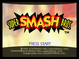
The logo's debut at the end of the opening of Super Smash Bros.
The logo can be seen inside the base of the Assist Trophy item.
The Bumper item showcases the logo in black and gold as part of its design.
The coins in Brawl carry the logo on both sides.
The Smash Ball item is depicted using a floating, rainbow Smash logo.
A Save Point in The Subspace Emissary showing the Smash Bros. logo.
In Brawl's stage select screen, stages from the Smash Bros. series, like Battlefield, have the Smash Bros. logo shown next to their name.
The cross-slash of the Super Smash Bros. logo as seen in the opening of every SSB4 Trailer, including the opening cinematic.
Unused artwork of Master Core from Super Smash Bros. for Wii U.
Mario's trophy in Super Smash Bros. for Wii U, with the symbol on its base.
Several Smash amiibo: like trophies, their base features the Smash logo.
- SmashLogoInklingSwitch.jpg
The flaming Smash Bros. logo with the Inkling looking at it.
Trivia
- The Super Smash Bros. logo coincidentally looks similar to the Sports Series logo used for old NES sports games, formed by the intersection of a baseball bat and a golf club on a tennis racket.

